Zum Inhalt springen
TradingView · NQ · OOS testedDE

Stop guessing the bias. Read the session like a map.

See the likely first raid, the validated run window, and the post-purge path directly on your TradingView chart — backed by 10 years of NQ data.

PAT Raid Map preview on a live NQ chartLive NQ chart

Launch offer: first 300 members · 7-day free trial · prices rise 20% after

  • First-target map: the most likely first stop of the session, ranked by 10 years of level races
  • Run-timing windows: the validated minutes when the move actually tends to happen
  • Purge-then-run detection: know when the counter-side raid is fuel, not failure

Historical statistics (NQ futures, 2016–2025, in-sample). Not financial advice. No performance guarantee. Not an entry signal — a context layer.

of NQ 1-minute data
10 years

of NQ 1-minute data

trading days analyzed
2,327

trading days analyzed

session events measured
13,136

session events measured

placebo-tested rules
86+

placebo-tested rules

Why this exists

Three findings from ten years of data — explained so simply your younger self would get it.

01

Session structure can be measured. So we measured it.

Most tools guess where the day will close. We asked 10 years of NQ data (2,327 trading days, 575,439 confirmed swing levels) two smaller, sharper questions instead: which level gets hit first in each session — and when does the run start? Asked that way, the data answers with real, repeatable numbers.

02

Every number beat a placebo — in two market eras separately.

A stat is easy to fake: almost any level “works” if you look at it kindly. So every rule had to beat 200 random look-alikes (random levels at the same distance, random time windows of the same width) — and it had to hold in 2016–2021 AND 2021–2026 separately. What failed was thrown out, and we tell you what failed.

03

We deleted our most tempting feature.

Equal lows sitting right under price look like perfect magnets. The data says: they got raided LESS often than a random level at the same distance — in all six sessions. So the Raid Map doesn’t draw them. Tools that paint every “liquidity pool” are showing you noise. We show you what survived.

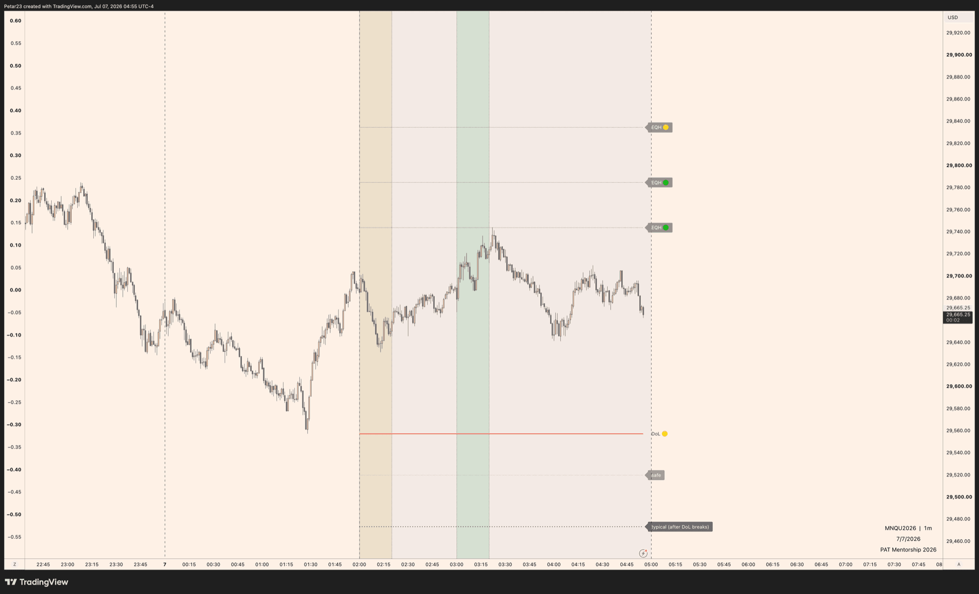
A real session, annotated

One live NQ chart, straight from TradingView. Here’s how to read the map in ten seconds.

PAT Raid Map on a live NQ 1-minute chart: red DoL line with traffic-light tag, validated EQH labels, safe and typical distance bands, and shaded session zones
🔴🟡🟢 The traffic light
Green = strong stats (held in both market eras), yellow = decent, red = careful. Hover any label and it tells you why in one sentence.
DoL line (red)
The level price most likely runs to FIRST this session.
EQH / EQL tags
Only the equal highs/lows that beat a random level in testing — the map refuses to draw the ones that failed.
safe / typical
How far the move typically carried after the DoL broke — distance bands, not reversal targets.
Shaded zones
Your session and the validated run-window minutes.

Try it on your own chart — 7 days free

The five layers of the map

Five layers. Each one carries its own validated number and a plain-English confidence tag.

First-Target Map (DoL compass)

Up to 2.1× random

Our top-ranked targets got hit first up to 2.1× more often than a random level at the same distance — statistically confirmed.

At every session open the map answers one question: which level got hit FIRST in ten years of races? Sessions cascade — each hunts the extremes of the one before it. You get one line and a plain confidence tag. No more staring at five levels wondering which one matters.

Run-Timing Windows

The first 20 minutes

The window where runs actually happened — confirmed against random time windows of the same width.

If the run comes, it comes early: in the NY morning, half of all session targets that fell, fell inside the first 20 minutes — and the odds decay fast after that. The validated windows sit on your chart as time zones, including London’s second wake-up in the early morning. Now “waiting for the move” has a clock.

Purge-then-Run Detection

~2× the odds

After an opening shakeout, the run followed about twice as often as random.

Before the run, the other side often gets swept — the move that shakes most traders out. The map marks the purge candidate in advance, shows your session’s purge risk, and flips to “PURGE DONE — ignition” live. You also learn what a NORMAL shakeout looks like, how fast and how deep, so it stops scaring you out.

Validated Micro Pools

6 / 6 sessions

Only equal-high/low pools that beat their placebo in every single session make it onto your chart.

Small equal highs and lows are the classic ignition targets — and most of them are noise. We tested them all against random look-alikes: only the statistically confirmed band gets drawn, each pool with its own track record one hover away. The tempting ones that failed the test? Deleted.

Terminus Bands

2–3× further

How much further the NY morning travels after the break, compared to every other session.

Once the target breaks — how far does it usually run? The map projects safe / typical / stretch bands from the break, scaled live by current volatility. Fixed point targets age badly; these don’t.

The Honesty Engine

“No signal”

When the data doesn’t back a number, the map says exactly that — and downgrades itself.

Target sitting far away? The map drops its own confidence to LOW and tells you that on most of those days it never got hit. No validated rule for your setup? It shows “no signal” instead of inventing one. Every number on the chart carries its full statistic, one hover away.

Behind every card: NQ futures, 1-minute data, 2016–2025, tested against fair random-placebo benchmarks — and confirmed on a one-shot out-of-sample year (Jul 2025 – Jun 2026). Exact numbers live in the docs and in every chart tooltip.
First 300 members only

Launch offer — first 300 members

7-day free trial on both plans. After the first 300 members, prices rise 20%.

Monthly

$54$45/month

Billed monthly after trial · cancel anytime

Save 36%

Annual

$35$29/month · billed $348/year

Billed yearly after trial · cancel anytime

  • PAT Raid Map on TradingView (invite-only access)
  • All five layers: first-target map, timing windows, purge detection, micro pools, terminus bands
  • Plain-English confidence tags with the full statistics one hover away
  • Weekly live streams reading the map on real sessions
  • All future rule updates while subscribed

You’ll create an account at checkout — access is granted to your TradingView username.

Cancel during the 7-day trial and you pay nothing. Your launch price stays locked for as long as your subscription stays active.

Historical statistics, in-sample (NQ futures, 2016–2025). Not financial advice. No performance guarantee. The indicator provides context, not entry signals.

Honest questions, honest answers

Is this an entry signal?

No. The Raid Map is a context layer: it tells you the most likely first target, the validated timing windows, and the scenario you are in. Entries, stops and risk are your job. Anyone selling you “validated entries” from bar data should worry you.

Has this been tested out-of-sample?

Yes — the hard way. Everything was built on 2016–2025 data, and we deliberately reserved one untouched year (Jul 2025 – Jun 2026). On July 7, 2026 it was tested exactly once, with pass criteria frozen in advance: 96% of the robust cells held their edge on data the research had never seen. Where the test disagreed, we adjusted the numbers we quote — one follow-through band now uses the more conservative out-of-sample value. That test can never be repeated, and that is exactly what makes it honest.

Which markets does it work on?

It was built and validated on NQ futures only. It will draw on other symbols, but none of the numbers were validated there — so we don’t claim they hold. NQ is the honest answer.

How strong are these edges really?

Modest and real: most premiums are single-digit percentage points above a fair random benchmark; the best cells reach roughly double the random odds. It is a probability compass, not a money printer. And 27–51% of days the session target simply never gets hit — the map tells you that too.

How does the 7-day free trial work?

You check out normally (card required), but nothing is charged for 7 days. Cancel anytime during the trial with one click and you pay nothing. If you keep it, billing starts automatically after day 7.

What happens after the first 300 members?

Prices rise by 20% ($45 → $54 monthly, $29 → $35 on the annual plan). Early members keep their launch price for as long as their subscription stays active.

How do I get access after paying?

The indicator is invite-only on TradingView. After checkout you enter your TradingView username and access is granted to it. A free TradingView account is enough.

Can I cancel?

Yes, anytime — monthly at the end of the month, annual at the end of the year. Access ends with the subscription.

Risk & transparency

All statistics shown are historical, in-sample results on NQ futures (1-minute data, 2016–2025) against random-placebo benchmarks, validated separately in two market eras, and confirmed on a reserved out-of-sample year (Jul 2025 – Jun 2026) that was tested exactly once with preregistered criteria. Past behavior does not guarantee future behavior. This product is a charting/context tool — it is not financial advice, not an entry system, and makes no profit claims. Futures trading involves substantial risk of loss.